Home
Publication
Examples
Tutorial
Get Started
Documentation
Tips
Online editor
About
Documentation
This page details the different constructs and operations in our specification. The Getting Started tutorial provides a gentler introduction for new users.
This documentation covers:
Panels and Layout
Panels
Comics are presented as a series of panenls. Panels can be .svg or .png. Panels are loaded within their specific array panels. Each panel has an id which must be some text e.g., "panelWithBarChart" or "p1". This id will be used througout the specification to refer to this panel. The ‘content’ of each panel is loaded from a url pointing to a URL where the image is hosted. You can host your SVGs or PNGs on any server in the world as long as the image or svg is publicly retievable throug a URL.
Code example
"panels":[
  {
      "id": "p1",
      "url":"mypanels/panel1.svg"
  },
  {
      "id": "panelWithBarChart",
      "url":"mypanels/panel2.svg"
   }
]
Comic Layout
The comic layout is specified inside the layouts array. You can specify alternative layouts which a user can load on demand using the Load layout operation. One layout needs to be set as the currentLayout.
Each layout needs a unique name. (tip: if you have several panels that are placed together and will be fixed forever (no interaction will dissassemble this panel group), you can export and manege these panels as ‘one’ panel (one single image).)
{
"currentLayout": "myLayout",
"layouts": [
   {
      "name": "myLayout",
      "panels": [["p1","p2","p3"], ["p4","p5","p6"]]
   }
]
}
This exmple will load six panels, three in each row.
Types of layouts
A layout is modeled as a nested array, e.g., [["p1","p2",["p3",["p4","p5"]]], ["p6","p7"]] with the first two levels being mandatory. This layout spec will create the following layout:
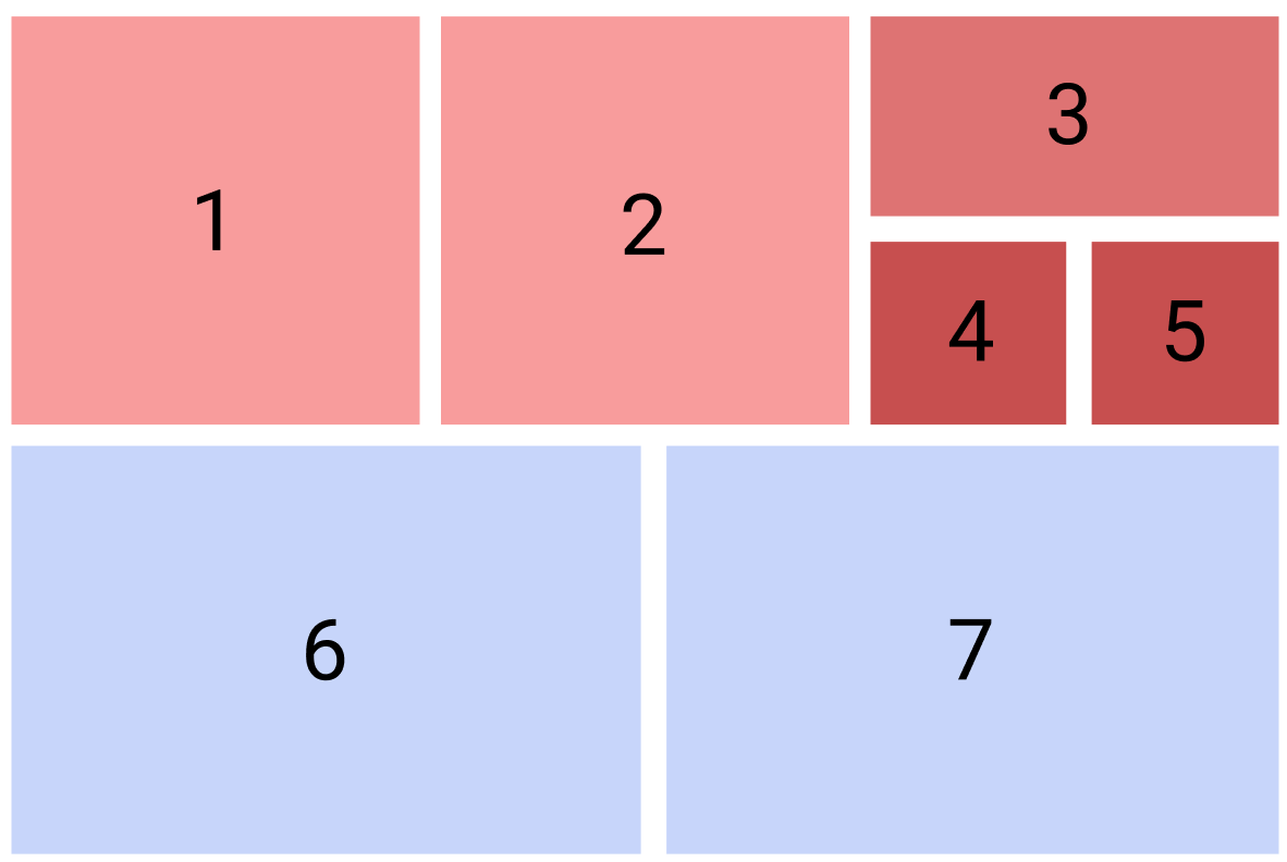
- The first array contains all panels. It is always there.
- The second level, e.g.,
["p1","p2",["p3",["p4","p5"]]](red) and["p6","p7"](blue), groups panels into rows. Each array is a new row. - the third level, e.g.,
["p3",["p4","p5"]](darker red) in our example, puts two panels, the first above the other within the same row. - The fifth level, e.g.,
["p4","p5"](darkest red) will place the two panels again side-by-side. “
Note: The with of panels depends on the SVG or PNG files. All the engine does is appending these panels and placing them in the layout. When you create your design, you should design a layout and panel sizes that work!
Data
Our spec has some constructs to refer to data, as it is intended for the construction of Data Comics.
Classes
Classes group visual elements within your elements into groups. Classes can be used to, e.g., highlight elements or otherwise refer to groups of elements.
Classes are only possible in svg panels and requires the elements you are referring to to have unique IDs, id="myBar" in the svg file. IDs can be the same across panels, e.g., if you have several panels with a bar chart, the first bar can always be called, e.g., bar1.
The following example groups three elements france, germany, uk under the class countries. Note that these classes work like classes in CSS, but any class attributes in your svg are ignored.
"classes":[
  {
     "class": "countries",
     "elements":["france", "germany", "uk"]
  }
]
Variables
Variables store numerical values. Variable values can be shown inside text through a place holder that has the same id to the variable, or used to render a number of ISOTYPE like symbols. Variables can be obatained from data, or through user input, e.g., using a slider (see below).
The optional value field specifies the default value if the variable is not set.
You can create calculated variables by functions, expressed though what.
The following example specifies variables with a default value. Two variables are based on functions.
"variables":[
  {
   "name": "movementSpeed",
   "value": 0
  },
  {
   "name": "movementVelocity",
   "value": 0
  },
  {
   "name": "totalMovement",
   "value": 0,
   "what": [
    "(",
    "movementSpeed",
    "+",
    "movementVelocity",
    ")"
   ]
  },
  {
   "name": "totalkm",
   "value": 0,
   "what": [
    "movementSpeed",
    "*2000",
    "+",
    "movementVelocity",
    "*8000"
   ]
  }
]
Operations
Operations are the core of interactive data comics. Operations specify what should happen how.
Highlight
The highlight operation can highlight content (e.g., panels or elements) upon a trigger; click or mouseover of a specified element. The highlight operations then highlights either:
- all elements with the same ID as the
elementifwhathas not been informed - or all element with the ID informed in the
whatfield
Highlighting can be used as a visual reference when the authors wants the audience to look back/forward at a certain panel or show that an element is the same across panel. For providing clear affordances, it can also be used as a visual feedback or feedforward for interactive elements, e.g., indicating clickable elements or change an element’s visual status after being clicked.
The highlight operation can change the style of the element(s) or class(es) with given ID. How an element is highlighted can be defined through attrbutes scale (scales an element up (scale > 1) or down ( scale < 1), border or color.
The following example highlights all elements (across all panels) with the ID france on mouseover one of these elements. The highlight causes these elemnts to become red ("fill": "red") and scaled up by 50% ("transform": "scale(1.5)").
{
     "trigger": "mouseover",
     "element": "france",
     "operation": "highlight",
     "what": "france-details",
     "after": {"style": {"fill": "red", "transform": "scale(1.5)"}, "attr":[]},
}
Append
This operation appends (inserts) one or more panels or a layout (newpanels) after given panel (after). The append operation is triggered through a trigger on an element (panel or element ID).
newpanels can contain
- a single panel: e.g,
["p3"], - a layout specified in-place, e.g.,
["p3",["p4","p5"]], or - a reference to layout specified in the
layoutsarray: e.g.,myLayout.
This operation can be used for different narrative purposes, e.g., adding a branch to the storyline from a certain point; providing more details by drilling down from this panel; revealing the answer for a question raised in the panel; hiding a punchline and etc. Note this operation will not romove or replace any panels. If you want remove any panle and load new panels, use “Load layout”.
The following example appends a panel "p11" after panel "p7" by a click on panel "p6".
{
   "trigger": "click",
   "element": "p6",
   "operation": "append",
   "after": "p7",
   "newpanels": ["p11"]
}
Load layout
This operation loads a layout from the layout array and removes anything else panel specified by after. The operation is invoked by a trigger onto element (a panel or an element ID).
This operation can be used similar to a menu on a website. For example, the designer can lead the audience to different versions (e.g., length, style or content) of the comic story by using a global navigation menu on the top of the comic.
The following example loads a new set of panels when clicking onto panel "p5".
{
   "trigger": "click",
   "operation": "loadLayout",
   "element": "p5",
   "layout": [["p1","p2"], ["p3","p4"]],
   "after": "p7",
   "group": "group1"
}
Remove
This operation will remove panels what after doing "click" or "mouseover" on the "element". In the example below, when "sub3" will be clicked "sub1" and "sub2" will be removed.
{
   "trigger": "click",
   "element": "sub3",
   "operation": "remove",
   "what": ["sub1", "sub2"],
}
Replace
This operation will replace a panel with newpanels after doing "click" or "mouseover" on the "element". In the example below, "p12" indicates the panel with the "id" of "p12".
{
   "trigger": "click",
   "element": "p4",
   "operation": "replace",
   "replace": "p4",
   "newpanels": [
    "p12",
    "p15"
   ]
  }
Pan & Zoom
Creates a simple pan and zoom behavior for a dedicated panel. Can also propagate that zoom to another panel (linked).
{
   "operation": "zoom",
   "trigger": "zoom",
   "element": "p2",
   "linked": ["groupToDrag"]
}
Jump
Jump to another view in the canvas
{
   "trigger": "click",
   "operation": "jump",
   "element": "down",
   "target": "p2"
 }
Conditions
Setting a condition for operations, when the operation is triggered, different operations will run under the condition set.
{
    "trigger": "click",
    "condition": ["totalC02", "> 10"],
    "operation": "loadlayout"
}
{
    "condition": ["totalC02", "> 10"],
    "operation": "append"
}
UI Elements
UI elements can be ‘injected’ into SVG panels (not possible with PNG), replacing an element with a specific ID. Values of UI elements can be mapped to variables.
UI elements are specified inside a panel spec.
Slider
A slider can be created for an element with a specific id and bound to a variable. The length of the slider will be as same as the placehover element. min and max are optional attribute indicating minimum and maximum value of the slider and its associated variable. Default values of min and max are 0 and 100 respectively.
The below example creates two sliders inside the panel spec for panel 0. Each slider is bound to a variable.
"panels": [
  {
    "id": "p1",
    "url": "/CO2Footprint/inputPanel.svg",
    "sliders": [
      {
        "id": "slider_movementSpeed",
        "variable": "movementSpeed",
        "min": 100,
        "max": 200
      },
      {
        "id": "slider_movementVelocity",
        "variable": "movementVelocity"
      }
    ]
  }
]
Number Input
"panels": [
  {
    "id": "p1",
    "url": "/CO2Footprint/inputPanel.svg",
    "input": [
      {
         "id": "slider_movementSpeed",
         "variable": "movementSpeed"
      },
      {
         "id": "slider_movementVelocity",
         "variable": "movementVelocity"
      }
     ]
  }
]
Isotype
This UI element creates one ore more ISOTYPE like pictograms inside an element (TreesPlaceHolder) and binds the number of icons to the value of the variable. The size of each icon can be adjusted in widthIcon. The icon is loaded from the svg specified by url.
{
   "operation": "isotype",
   "variable": "treeIcon",
   "to": "TreesPlaceHolder",
   "attr": {
    "widthIcon": 4.5
   },
   "icon": "images/CO2Footprint/treeIcon.svg"
}